His Aqueous work has become very collectable and an Aqueous video was projected onto the walls of Buckingham Palace for the backdrop of Sir Paul McCartney during The Queen's diamond jubilee concert.
He is represented by several galleries and his personal work is in many private collections around the world.
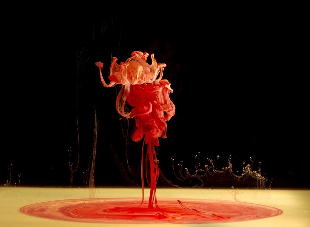
I quite like this photographer because he does the only liquid inside water images which portrays dramatic scenes. The photographer uses loads of different colours of liquid. He uses black backgrounds which gives the photograph a flowing free, textured feel. Almost a fragile illustration of colour.
Examples of Mark Mawson's photography


First Response of Mark Mawson

In this image, it is not really vibrant because I have used the white background and didn't use the light closer to the paint. However this photographer uses the black background to make the paint get the attention from the audience, and also he uses the light to make the paint brighter and more vibrant. For the improvements, I would use black for the background and also use the light to make the paint brighter.

I find this image very interesting because as you can see the black has started flowing back up. I rotated the image to make it look more interesting. This image is unclear so for the development of this image, I would try to take image again to make more clear and change to the black background to make the paint more brighter. I would like to use brighter colour inks too so that they stand out more.

I am disappointed with this image as it is unclear, but the paint is very dramatic in the water which makes the image more interesting. You can see the background has a smooth gradient of white to green which gives the audience a feeling of calmness. When i see this image, I feel it's environmentally friendly because the green colour in the background makes me think about the world.

In this image, the paint creates interesting unique shapes which makes the image attractive. The disadvantages of this image is that you can see the reflection of the glass and also you can see the light on the glass which makes the audience get distracted. For the development of this image, I would move the lighting away from the glass so you couldn't see the reflection.

As the disadvantages of this image is very unclear, and again you can see the reflection on the glass. But I like the way the paint creates unique shapes in the water. It's like its flowing down. I also like the boldness of the paint.

I like this image because it's creating patterns. When I see this image, it make thinks that I can create the image in my mind of what it looks like. But as a drawback, this image again is unclear, and you can see the reflection on the glass which makes the audience get distracted.

This image shows us the different colours are pouring and mixed together such as red, black and green. I love the way the top of the image the colours are mixed together. For the improvements, I would take new images with the black background which makes the paint brighter and more vibrant.

2nd Response of Mark Mawson

I had done my 2nd Response of this photographer Mark Mawson to improve my response. In this image, as you can see the blue paint is very vibrant, unique and eye-catching. When I see this image, it make me feel what the shapes look like. I like the way the blue reflection on the glass which makes the image interesting. I had use this image on Photoshop to adjust by contrast and brightness. This image is taken in studio with the black backdrop and two studio lights are near them to make the blue light get brighter and unique.

I tried to do experiment of different backgrounds and different colour of water paint. I prefer the black background rather than using white background because the black background is less distracted than the white background. And also I love the way the shadows in the background which makes the image more interesting and contrasting with two different colours green and white. The setting I used the studio manual.

In this image, as you can see the blue reflection is glowing from the glass to make it more interesting and more unique. I like the way the two different colours of blue and green mixed together into dark colour. I had use this image on photoshop to adjust the background and the contrast to make it more interesting and more vibrant.

How this relates to my theme? There are many different types of pouring. This image shows us that the liquid is poured into the water which creates the water paint into different shapes and different patterns. However, the colour of the water paint yellow is bright, eye-catching and vibrant. Whereas, on the black background, there is tiny bits of water paint which makes it distracted and also I can see the reflection on the glass which makes it more distraction.

I really like this image because it is very dynamic and it has different shadows in it, the gradient of orange (lightness/darkness). I had use this image on photoshop to adjust by using contrast and brightness to make this image more vibrant.
No comments:
Post a Comment